Strategic Clarity
Defining the strategic core that allows organisations to explain themselves clearly and communicate with coherence across teams and contexts.

Organising a global gathering like the World Economic Forum Annual Meeting involves an exceptional level of complexity.
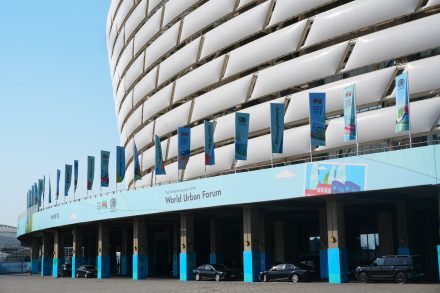
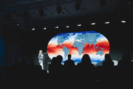
Across multiple venues, formats and teams, one of the key challenges was ensuring that every visual element felt consistent, recognisable and easy to apply — without adding friction to already demanding workflows.
Our role was to design a visual identity that could function as a practical system. One that different teams — from signage to stage design and broadcast — could use confidently and consistently, while remaining aligned with the Forum’s values and visual standards.
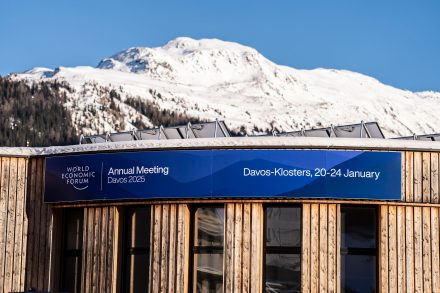
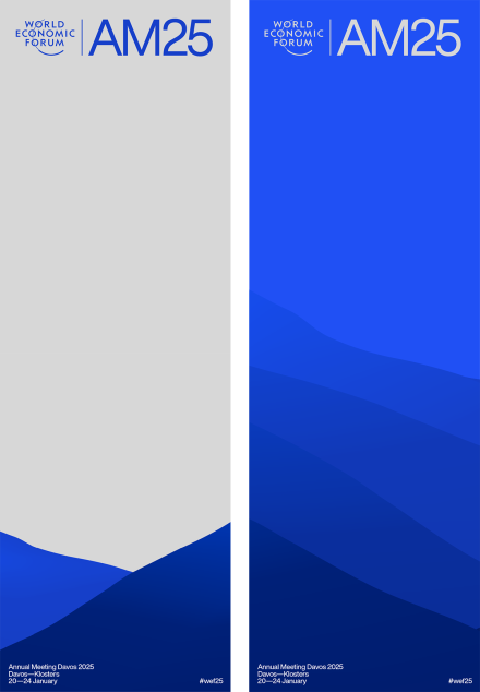
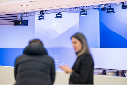
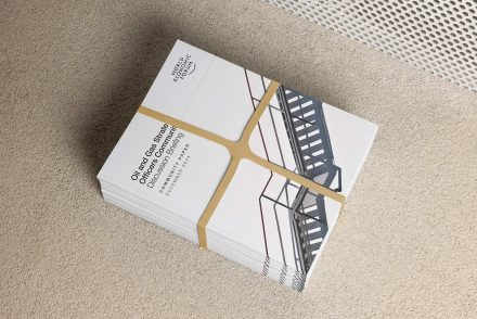
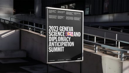
The system was inspired by the landscape of Davos, using abstract mountain forms as a unifying graphic element. This created a strong sense of place, while remaining flexible enough to work across a wide range of applications — from printed programmes and screens to signage and live broadcast graphics.
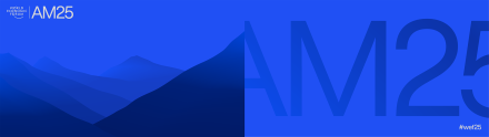


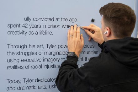
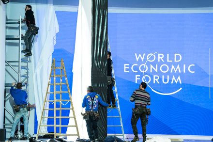
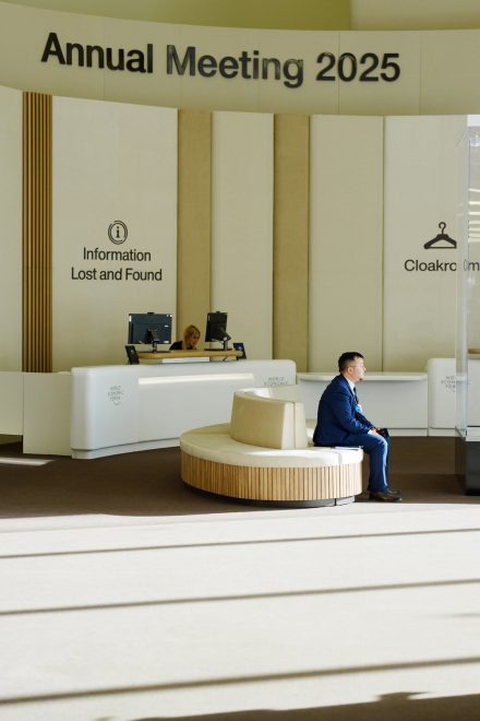
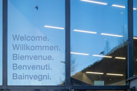
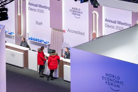
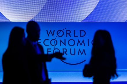
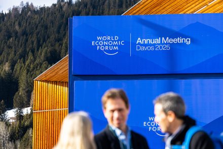
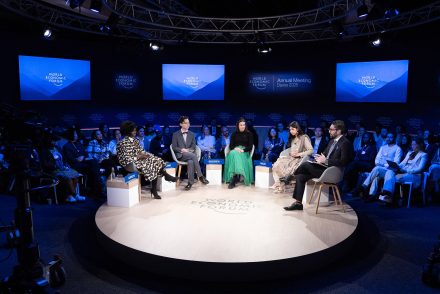
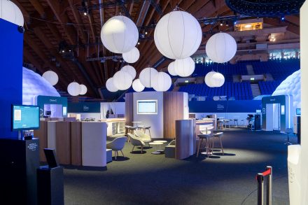
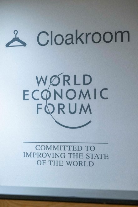
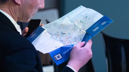
To support rollout at scale, we developed a comprehensive set of templates and usage guidelines. This allowed teams to apply the system consistently and make decisions with confidence, even under tight timelines.
The result is an identity that brings structure to complexity. A system designed to stay coherent across contexts, enabling teams to focus on what matters most — content, coordination and the experience on the ground.

Everything worked effortlessly. The system felt intuitive and light, removing friction rather than adding it. It allowed teams to focus on what mattered, and everything flowed naturally.
Pascal Bitz
Boris Baldinger
Ciaran McCrickard
Jakob Polacsek